Hotsuki Family Foundation—Brand Identity & System Design
Recreating a family foundation to reflect cultural roots while embracing new ideas
Problem Statement:
The Hotsuki Family Foundation supports underrepresented individuals and students through mentorship. Rooted in both Japan and the U.S., the brand identity is needed to honor its cultural origins while reflecting a forward-looking mission.
Solution:
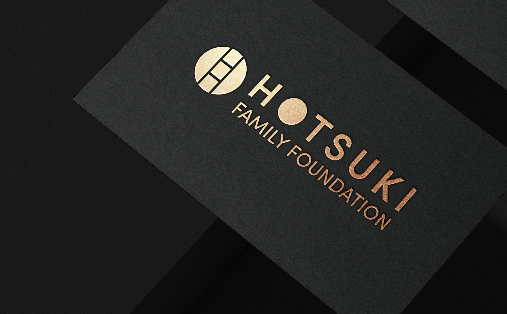
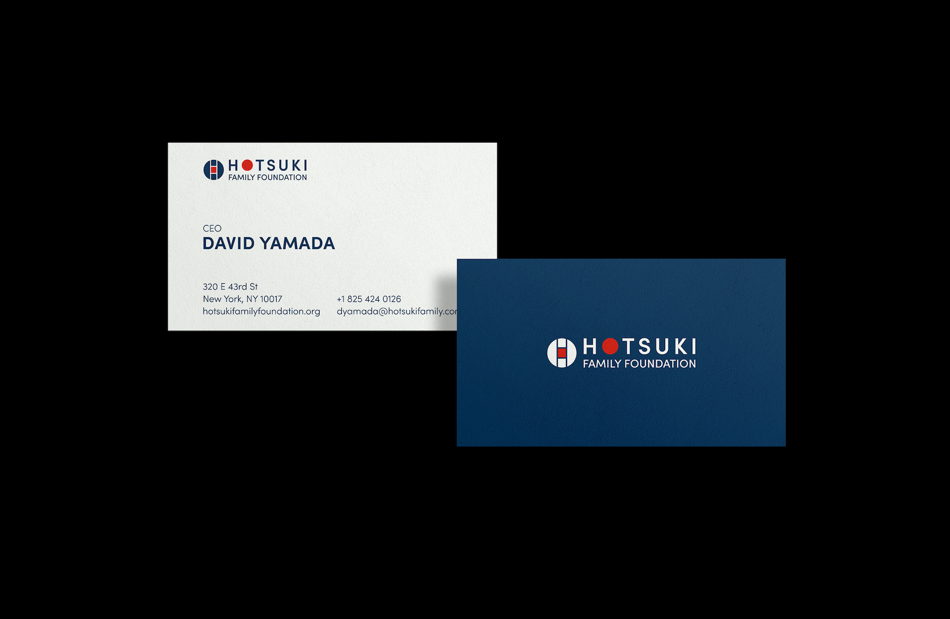
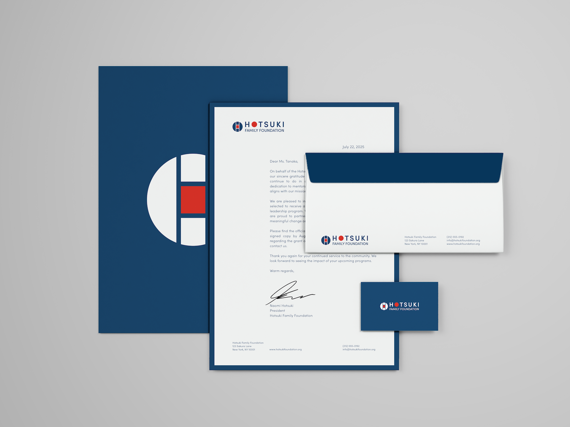
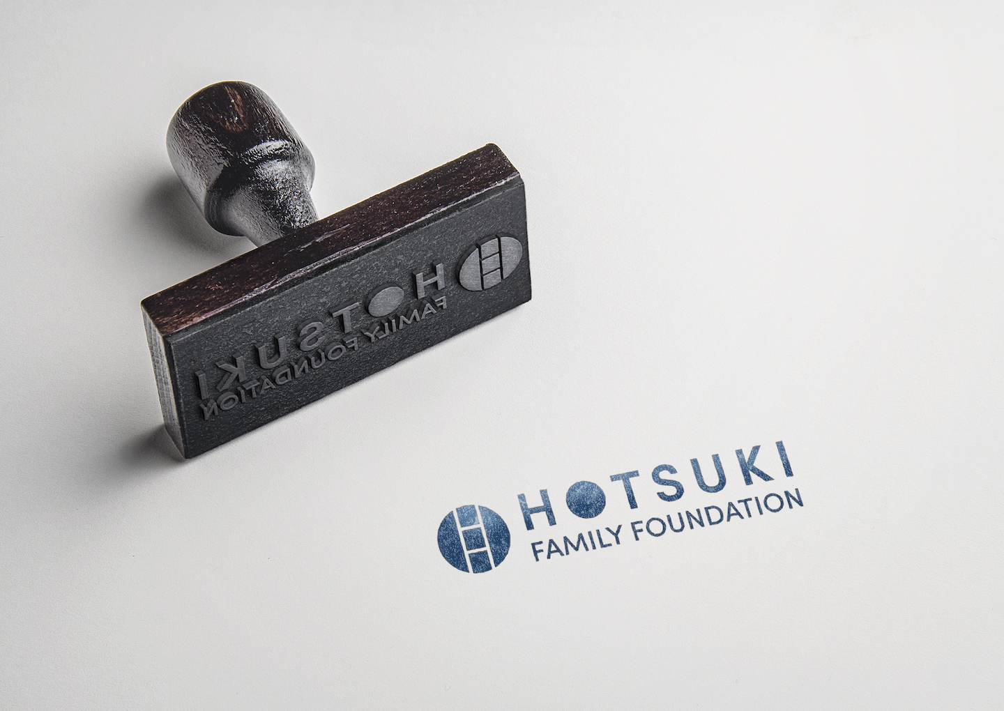
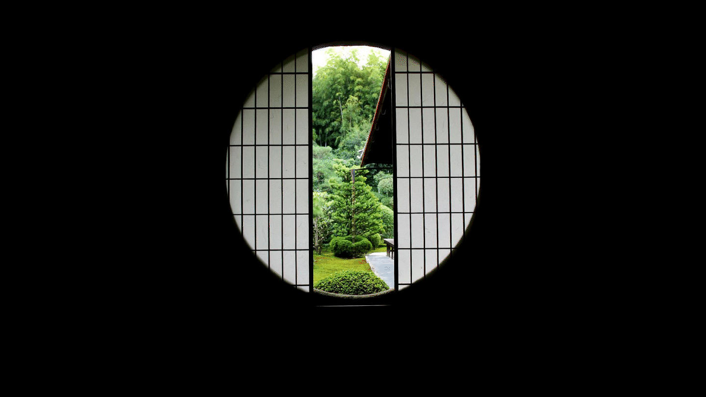
I designed a logo inspired by traditional Japanese circular garden windows—symbolizing a view into new ideas while staying connected to heritage. The color, Ai-iro, is a classic Japanese indigo, reinforcing its cultural roots.
Duration:
4 weeks

The logo is reimagined by Enso, traditional windows often found in Japanese gardens.

Creating a color palette based on Japanese traditional colors that are inspired by nature, art, and human emotions.